
Every right-thinking person should deplore Rolling Stone magazine for being a glossy nostalgia rag and corporate liberalism enabler. But every now and again one may gaze into the void and find insights.
Imagine record sleeves without the advent of Hipgnosis, the photo-design company responsible for Pink Floyd‘s mysterious black prism, Led Zeppelin‘sflaxen-haired nudist children, AC/DC‘s censored everyday villains, Black Sabbath‘s copulating escalator robots and Peter Gabriel‘s melted grilled-cheese face. Although the psychedelic era produced beautifully filigreed LP sleeves like Love’s Forever Changes and, of course, Sgt. Pepper’s, album covers largely were portraits of the bands and artists. Hipgnosis – cofounded by artists Aubrey “Po” Powell and Storm Thorgerson in 1967 – flipped the script on rock art.
Kory Grow, “Hipgnosis’ Life in 15 Album Covers: Pink Floyd, Led Zeppelin and More“, Rolling Stone
Most people know Hipgnosis from the Dark Side of the Moon cover. And let us stipulate the premise of the pull quote. Album art, qua art, is a marvelous genre that merits study. If there’s a reason I refuse to fully embrace the world of digital music – other than the fact that musicians get paid squat from streaming services – it’s because the diminishment of album art. CD’s retain album art, and even put art on the CD itself, which you can’t always do with vinyl. Somehow having it merely display on your phone just doesn’t do it.
So let’s take a gander at what Rolling Stone thinks are the most interesting Hipgnosis album covers. I’ll include links to the music as well.
1. Pink Floyd, Atom Heart Mother (1970)

That is a picture of a cow all right. There’s a whole bunch of noise in the paragraph underneath of how this picture of a cow became the album cover, with the bold “we’re not even putting any text on it” storyline. Wow, such subversive. My expectations are shattered. You took a picture of a cow.
2. The Nice, Elegy (1971)

Who the hell are The Nice?
I mean, cool, you took a picture of red balls on a ridge in the desert. It looks neat. It looks like an album cover. It probably helped move product.
But I’m listening to it, and it sounds proggy and directionless, a supergroup of guys rejected from Chicago and ELP. Drivel like this is why Punk happened.
3. Pink Floyd, Dark Side of the Moon (1973)
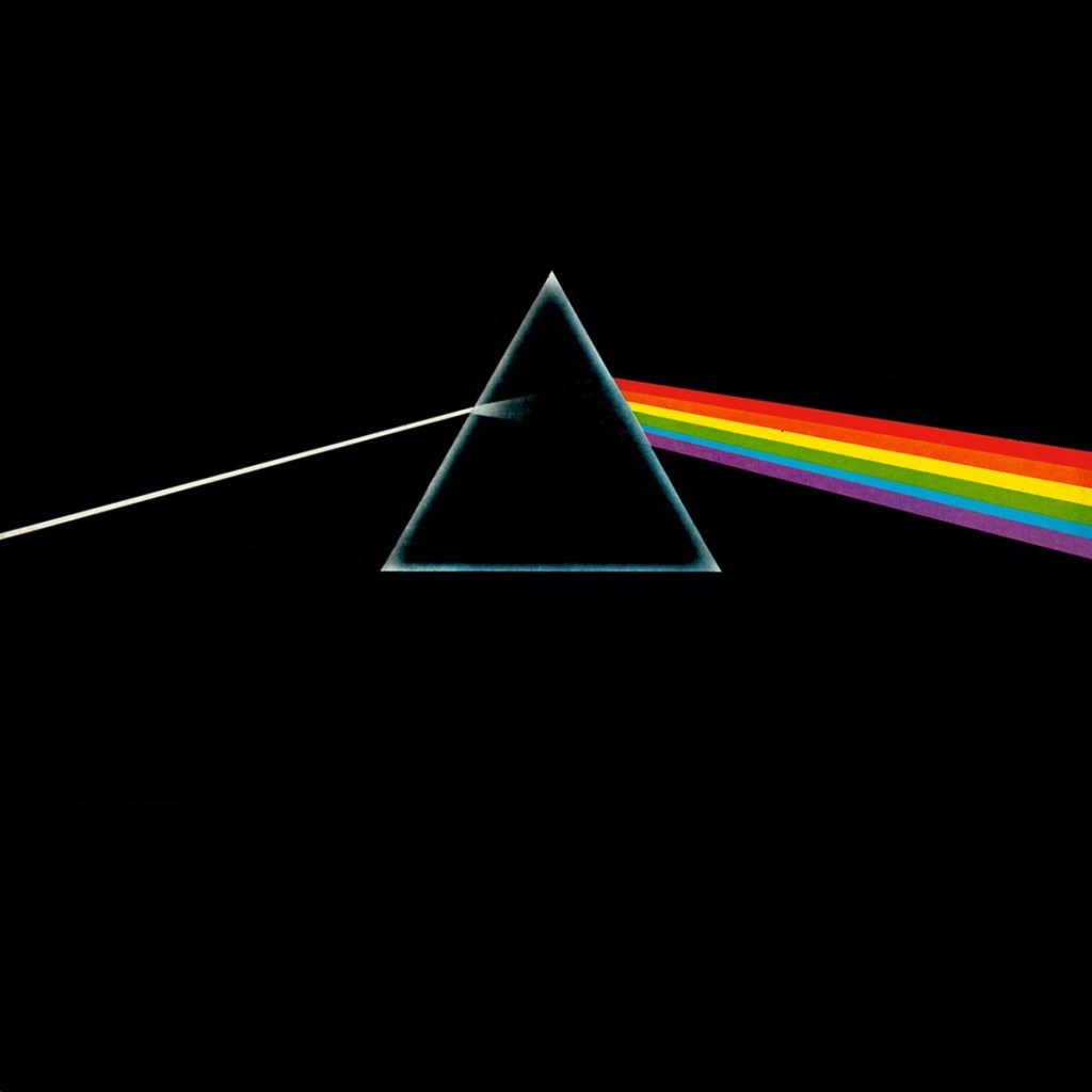
Like I said, this is the cover that most people know, this is the album that most people have listened too. Dark Side of the Moon is as good an album as people like to pretend any of the later Beatles albums are. And the cover art is striking and accessible, while still conveying enough mystery to keep art students intrigued. A win all around.
4. Led Zeppelin, Houses of the Holy (1973)

I’m just gonna say this: I have never liked this album cover. The colors are lurid, the effect is grotesque, and those are naked children butts for no good reason. There’s a time, when you’re a baby or toddler, that your naked butt is comical. This is not that time, so it’s weird and makes me uncomfortable. It always has. I realize that’s probably the intended effect. And yes, the Louvre is full of paintings of naked people, including children. I still don’t like it.
The album’s fine, it’s better than Physical Graffiti, but it’s not as good as the first four. No Zeppelin album is as good as the first four. They peaked early and declined long. That’s just how it is.
5. Genesis, The Lamb Lies Down on Broadway (1974)

Genesis, for when you find The Nice too aggressive.
I’m supposed to approve of this, because this is Peter Gabriel Genesis, not Phil Collins Genesis. Whatever, proggies. This is so pretentious it could be Styx. And while the tryptych of images is clever, I don’t enjoy looking at it. So, meh.
6. Pink Floyd, Wish You Were Here (1975)

WE’RE HALFWAY THROUGH THE 70’S YOU GUYS. WE’RE GONNA MAKE IT!
This is also a great album, and a cool cover, although the kids need to understand that it’s not Photoshop. They lit a stuntman on fire to get this shot. Nobody was hurt, but they had to light him on fire 15 times to get the shot right. Art requires suffering, just not necessarily the artist’s.
7. Wings, Venus and Mars (1975)

There’s a whole story in the RS article about this cover, which could all be truncated to “Paul McCartney had an idea of using two balls, one yellow and one red. That’s what we went with.”
And like everything else associated with Wings, the album cover is pleasing and inoffensive but somehow thinks it’s cool. It insists upon itself.
8. 10cc, How Dare You! (1976)

After a bunch of arty-farty codswallop, this semi-joke cover is refreshing. It’s exactly what you think it is. It tells a story.
10cc is one of those bands I’ve heard of but not listened to. This album sounds like the Kinks, if the Kinks had managed to pull out of the Village Green Preservation Society pastoral whimsy, but retained enough of it as flavoring, rather than making them forget they were a rock band.
9. Black Sabbath, Technical Ecstasy (1976)
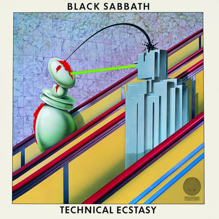
Ozzy-era Sabbath, will wonders never cease? And unlike Zeppelin, Sabbath didn’t fall off in decline after their first four albums. They didn’t even decline in the Dio years, going by Heaven and Hell.
On one level, this is far lewder an image than Houses of the Holy. We’re supposed to get the idea that these robots are falling in love on the escalator, even copulating in some way. But on another level, there’s nothing lewd about robots, and I don’t care how much you want to snigger about Rule 34 to me. This is a joke. This is probably the only album on this list (aside from the Pink Floyd and Zeppelin ones I already own) I could see myself buying.
10. Led Zeppelin, Presence (1976)
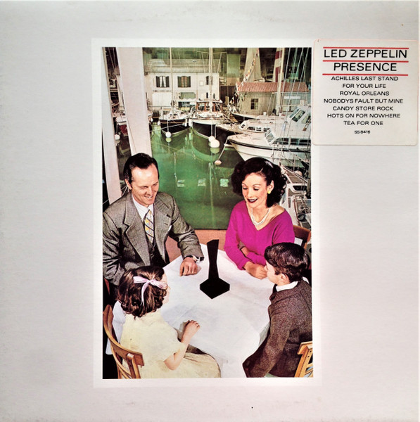
We are lingering in the year of my birth. Can’t complain, I guess.
I feel as though I’ve been unnecessarily hard on Led Zeppelin. The plain fact is that “Achilles Last Stand” the opener on this album, rocks as hard as anyone has the right to expect. And they sustain it for ten minutes. That’s nothing to sneer at. The rest of it doesn’t suck either, especially “Nobody’s Fault But Mine”. This is nobody’s favorite Zeppelin album, but it’s still pretty good.
That said, this isn’t a very interesting cover. Family around a table, looking at a mini-version of the monolith from 2001, got it. If this traded places with that The Nice cover, I wouldn’t complain.
11. AD/DC, Dirty Deed Done Dirt Cheap (1976)

Dirty Deeds DONE DIRT CHEAP
Dirty deeds DONE DIRT CHEAP
DIRTY DEEDS DONE DIRT CHEAP
dirty deeds and they’re done dirt cheap
dirty deeds and they’re done dirt cheap
How many album covers have had black bars over eyes? That always seemed a strange way to conceal identity: most of the face is still available. Would it really take that long to find a match?
Anyway, this is both the least Hipgnosis’y album cover so far, and the one most connected to the album title. Good for AC/DC.
12. Yes, Going For the One (1977)

Okay, but like
why though
13. Peter Gabriel, Peter Gabriel (1978)

The story with this one is that there’s a picture of Peter Gabriel, which Peter Gabriel is scratching. Apparently Peter Gabriel insisted on having a portrait of Peter Gabriel, but was fine with destroying it, because Peter Gabriel is so self-deprecating, and if you think that’s a lot of uses of the name “Peter Gabriel”, you ain’t seen nothing yet.
I am obligated to point out that this is both better visually and as music than Lamb Lies Down on Broadway.
14. Peter Gabriel, Peter Gabriel (1980)

Yeah, that’s right, he did the same thing two years later. And also for his first album in 1977. And another one in 1982 So that’s four eponymous albums in a row, to start off his solo career. Spotify has to classify them as “Peter Gabriel 1: Car”, “Peter Gabriel 2: Scratch”, “Peter Gabriel 3: Melt”, and “Peter Gabriel 4: Security”. Self-deprecating, my ass. At least Weezer spaces them out and changes the color, so everyone just calls them Blue Album and Green Album and Red Album and such.
That said, “Intruder” is a pretty good track. This is when they guy really started getting weird, so I’m here for it.
15. 10cc, Look Hear? (1980)

We finally made it into the 80’s and I was so annoyed by Peter Gabriel I didn’t notice. I can take comfort in this being the worst cover on the list.
Apparently the idea to include a tiny picture of a sheep sitting on a psychiatrist’s couch on the beach was a compromice between the two Hipgnosis partners. One of them wanted to do the huge ugly lettering, and the other one flew to Hawaii to get the shot of the sheep. The idea is that the sheep represents docile people seeing psychiatrists, and the ocean represents the mind, and the chair is their to clue people in on the joke. They had to give the sheep valium to get it to stay still enough to take the picture. Rock n’ Roll, amirite?
The band went with the original ugly lettering and shoved the picture in to make everyone happy. Of course, if you buy it on Amazon or listen to it on Spotify, it’s just the sheep picture. Good taste wins in the end, I guess.
This album seems a little more consistent than How Dare You.
Hipgnosis dissolved in 1983, so that pretty well covers the run, Here’s some other album covers that Rolling Stone didn’t think made the cut:


I’m not saying my list is better. I’m not NOT saying it, either.
